
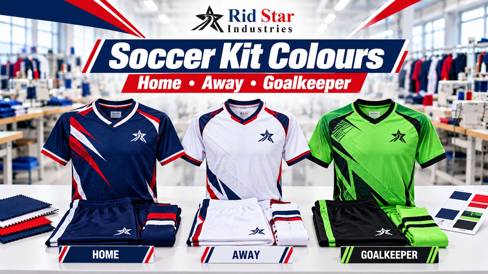
How to Choose Soccer Kit Colours for Home, Away and Goalkeeper Kits
Choosing soccer kit colours involves more than selecting a club’s favourite shades. Home, away and goalkeeper designs need to work together as a practical set of options, with clear player identification and suitable contrast against opponents.
For clubs, schools, academies and teamwear distributors, these decisions are best made before artwork is approved for manufacturing. A second shirt that looks different in a presentation may still leave the team with a colour clash on match day.
This guide explains how to review kit combinations, prepare colour references and give your manufacturer a clear brief.
Check the Competition Requirements First
Start with the requirements for the competition and season in which the kits will be used.
Under IFAB Law 4, the teams’ colours must distinguish them from each other and the match officials. Goalkeepers must also be distinguishable from the other players and officials.
Read the current Law 4 equipment guidance, then ask your competition organiser about kit registration, approval procedures and responsibility for changing when colours clash.
Do not assume that “home” always means dark and “away” always means light. Use the requirements applying to your competition.
Also confirm any instructions covering numbers, sponsor artwork and competition badges before finalising the design. Give the manufacturer the relevant requirements rather than expecting it to infer them from the club’s location.
Give the Alternate Kit a Clear Purpose
Your home kit can establish the club’s familiar identity. The alternate kit should provide a useful option when that identity creates a clash.
Compare the dominant colour areas, not just the colour names. A navy home shirt and a slightly lighter blue alternate may look distinct beside each other but still offer limited choice against another predominantly blue team.
Changing only the collar, sleeve trim or sponsor colour may not create a sufficiently different overall appearance.
Review front and back views of both designs together. Consider stripes, large panels and gradients as part of the overall colour distribution.
For example, a club might explore a predominantly navy home shirt and a predominantly pale alternate shirt. That is a design starting point, not confirmation that the combination will suit every fixture. Compare the proposed options with likely opponents and obtain any required competition approval.
Keep club identity consistent through details such as the crest, typography or a restrained accent colour while giving the alternate design a distinct main appearance.
Review Shirts, Shorts and Socks Together
Prepare a full-kit illustration for each proposed combination. Do not approve shirt artwork while leaving shorts and socks undecided.
Show the front and back of the shirt, the shorts and the planned sock colours. If you intend to mix an alternate shirt with another pair of shorts or socks, include that combination separately.
A simple planning table helps prevent confusion:
| Kit reference | Shirt | Shorts | Socks | Review status |
|---|---|---|---|---|
| Home H1 | Main design and colour reference | Agreed colour | Agreed colour | Pending or approved |
| Alternate A1 | Contrasting design and colour reference | Agreed colour | Agreed colour | Pending or approved |
| Goalkeeper G1 | Proposed goalkeeper design | Agreed colour | Agreed colour | Pending or approved |
| Goalkeeper G2 | Backup option, if required | Agreed colour | Agreed colour | Pending or approved |
Use these references on artwork, quotations and order sheets.
If socks or other components are being purchased separately, include their references in the review anyway. Confirm which items your manufacturer is supplying and which the club will source elsewhere.
Plan Goalkeeper Colours Alongside the Outfield Kits
Review goalkeeper options at the same time as the home and alternate kits.
Compare each proposed goalkeeper combination with both of your outfield designs. Then consider likely opposing kits and the officials’ colours, with the competition organiser’s guidance where needed.
A bright colour is not automatically suitable for every match. If the opposing team wears a similar dominant colour, another goalkeeper option may be needed.
Ask whether your competition expects a registered alternative or has a procedure for resolving clashes. Plan the quantity and sizes needed for starting and replacement goalkeepers rather than copying the outfield size breakdown.
If you are considering different sleeve lengths or goalkeeper trousers, show those choices in the kit brief so the colour review reflects what will actually be worn.
Keep Numbers Clear Against the Design
Review player numbers at their intended size and position on the finished shirt.
Place them over the actual background artwork. Stripes, gradients and busy graphics can make a number harder to read even when its colour looks distinct on a plain mockup.
Check the front and back designs wherever numbers are required. Review examples containing both a single digit and two digits, using the proposed typeface.
Ask your competition organiser about number dimensions, positioning and any required background panel. Do not assume that an outline around the number resolves every visibility issue.
Assess the physical sample from a practical viewing distance. Check it while worn so folds and the garment’s shape are part of the review.
Make artwork changes before approving the complete player list for production.
Approve Physical Colour References
Give the manufacturer a clear reference for each important colour. Identify the reference system being used, or provide an agreed physical swatch.
A screenshot of the club logo can communicate the design direction, but it should not be the only basis for a close colour match.
Ask to review the proposed colour on the actual material and with the intended decoration process. If different materials are used across the shirt and shorts, assess them together.
If fabric selection is still open, our guide to choosing the right fabric for sports uniforms explains the material details to settle before sampling.
Label the approved sample or swatch with its date, kit reference and colour reference. Record any accepted differences rather than leaving approval as an informal message saying “looks fine.”
Send One Final Kit-Colour Brief
Before authorising production, collect the approved decisions in one current document.
Include:
- Home, alternate and goalkeeper kit references.
- Front and back artwork for every version.
- Shirt, shorts and sock colour references.
- Number colours, typeface, dimensions and positions.
- Crest, sponsor and badge artwork.
- Quantities and sizes for each kit version.
- Approved physical sample or swatch references.
- Any competition approval relevant to the design.
Identify one person who can approve changes on behalf of the club. If the sponsor artwork or a colour changes, issue a revised file and state which earlier version it replaces.
Keep the approved documents for future purchases. For later additions, reconfirm the material and colour references before asking for another production run.
Discuss Custom Soccer Kits with Rid Star
Rid Star Industries manufactures custom soccer uniforms for B2B buyers, including clubs, schools, brands and distributors. Our custom soccer uniform manufacturing page outlines the product and customisation options.
Our minimum order quantity is 10 pieces/sets. Share the quantities needed for each home, alternate and goalkeeper design so the available combinations can be confirmed.
Send your proposed artwork, colour references, sizes and required arrival date through our quote builder. Include the competition requirements and identify which designs have already been approved by your club or organiser.